Showing posts with label Pure White. Show all posts

While we are on Green.....


This color wheel features 6 of the custom colors made when Annie Sloan Chalk PaintⒸ Antibes Green is mixed with varying amounts of English Yellow and varying amounts of Arles.  Also represented are variations of each of these custom colors when mixed with different amounts of Pure White.

So how is this helpful?  Many of my clients are more familiar with paints made by other manufacturers, Martha Stewart, Sherwin Williams, Farrow & Ball but especially Benjamin Moore. They will bring me a color swatch from Benjamin Moore and ask me to paint a piece of furniture that color.


Although I think Benjamin Moore is an excellent paint for walls, I don't like using latex on furniture( I will explore that in another post). My client  doesn't usually care about the brand as much as the color, in this case Wales Green.   In order to use Chalk PaintⒸ, I must be able to match the color my client has chosen. This is where the color cards of custom colors are very helpful, because it gives you a good place to start. Mixing Antibes Green and English Yellow and then adding some white will get you very close to "Wales Green". It does take some trial and error,  and some fine tuning, but the more you do it the easier it gets. If it is very important to match the color exactly, I will pick up a sample of the Benjamin Moore paint just to be sure. In the end, mixing my own color to match, allows me to use my paint of choice. Usually for furniture it is Annie Sloan Chalk PaintⒸ.


Shades of an Armoire

Sometimes it is not so clear what color to choose when painting a special vintage piece of furniture. Colors, Tints, and Shades can look very different from one piece to the next.  Painting a large Armoire, like the one above, involves a fair amount of time and energy, not to mention the cost of paint.  Any tool you can use to eliminate, or even narrow down, your color choice before you start to paint can save you from painting something more than once. 

The image above is a virtual representation of an Armoire painted in 6 different colors and shades (shades = color + black) of Annie Sloan Chalk PaintⒸ.  I didn't actually paint the Armoire 6 different colors.  Each armoire image was tinted with shades of one color. The color cards below each show the color I used. This is only meant to be a starting point, but sometimes having a comparison on an actual piece of furniture is helpful.
Here is the real Armoire and the colors I used when I painted it......


A Bright Spot in Your Day


Count on Annie Sloan Chalk PaintⒸ in English Yellow to add sunshine and warmth to your room. The Country Grey and Cream accents, with Pure White highlights,  are a refreshing combination with an English Yellow base. Simple and easy.


Lovely Lavender


This sweet Armoire was painted for a little girl's room. I used Annie Sloan Chalk PaintⒸ in the colors shown on the image, layering but also mixing Emile and Henrietta to make a custom Lavender.The inside is painted white, but I forgot to snap a photo. Some of my favorite projects are those I do for childrens' rooms and this one was especially fun.

Lavender is a soothing accent color. For more ways to add lavender to your decor see my posts,    Lavender in Provence,  and  Modern Gustavian by Wisteria

Annie Sloan Chalk Paint Green Custom Color Swatches


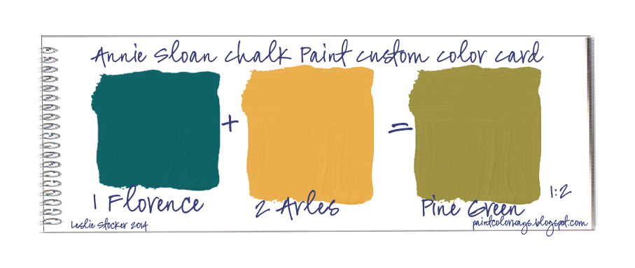
Here is a new page in my Annie Sloan Chalk Paint Color Swatch Book. It combines the color cards  for the additional green colors you can mix, by using Antibes Green + English Yellow, Antibes Green+ Arles and Florence + English Yellow, and Florence + Arles. It also shows the results when these new custom colors are blended with varying amounts of Pure White to make tints.

I physically mixed these colors and scanned them into my computer from my project and color journals. The colors are accurate, as much as they can be. Remember, however, actual paint samples look different than those on a computer display. The names for these additional green colors are mine and not official Annie Sloan Chalk Paint colors, although I did use ASCP to create them.  The numbers on each color card represent the equal proportion of each color to the other.  Please let me know if you have any questions. 


   Annie Sloan Chalk Paint®  You can find more color studies by clicking on the Tools tab or referring to my posts ASCP Colors + Tints  and  ASCP Colors + Shades.


I like Annie Sloan Chalk Paint  for my craft and furniture projects, but for walls nothing compares to Pure & Original Fresco Lime Paint. I love the natural variations of shades and tones the lime creates within one paint color. You have to see how gorgeous it is! Checkout my most recent interior design make overs with Fresco. It can be purchased online at www.502paint.com
Bohemian inspir
P.S  Pure and Original also makes a chalk based paint called Classico in 140 colors! Its amazing too!
12357029_1656390691305874_742157543163796326_o


Pine Ombre Cabinet


This pine cabinet is for toy storage in a children's playroom. It was purposefully painted to have a very distressed, chippy finish, with a fun ombre color effect. Annie Sloan Chalk Paint is definitely the way to go on a piece that will have heavy use, wear and tear.  It is also a great example of expanding your range of green.


I have a few more green color studies to share These focus on mixing Florence with English Yellow, and Florence with Arles.


 It is helpful to have a comparison of the difference of green when using English Yellow as opposed to Arles. There is a typo in the last sample card. The correct proportion should read 1 part Florence to 2 parts English Yellow.


Light it Up

Even brass chandeliers can be given a new life with Annie Sloan Chalk Paint. A coat of  Graphite will usually cover the brass ( I have never needed  a primer), followed by a quick coat of Coco, and Paris Grey. It is not necessary to completely cover each of the preceding  layers of paint. Purposefully  leaving gaps in the colors enhances the look of vintage patina.  Dry brushing Old White, and Pure White  on  selectively will highlight the raised portions.

Not So Simple

I love these old vintage chests that show traces of former incarnations in their paint colors. You know at some point it had been solidly painted all of the colors above and probably more. Using Annie Sloan Chalk Paint in these colors and the tints shown below will create a similar finish. 

Usually I layer the colors, purposely leaving gaps, to create a look of wear. Another technique I use is to dip one side of my brush in one color and the other side in a different color.  Laying your paint on in this way results in areas where the colors are separate, but also where the paint mixes and becomes a third color, increasing depth and texture.

To match the colors on this piece you will have to play a bit combining Pure White, with the Greek Blue, the Henrietta, and the English Yellow in approximatly equal parts or  1:1. Being exact is not important, and you may end up with more or less white in your color combinations. If you don't have Pure White you can use Old White, although your tints will be slightly different. The character of a vintage piece is enhanced by these variations and imperfections.  Part of its charm is knowing it was painted by hand.


English Lavender

Create a lovely English Lavender by layering Annie Sloan Chalk Paint in these muted tones of purple.
 Reminds me of this photo...


Downderry Lavender Nursery
English Garden Magazine 
photo by Susie Gibbons 


Lavender is a soothing accent color. For more ways to add lavender to your decor see my posts,  Lovely Lavender,   Lavender in Provence,  and  Modern Gustavian by Wisteria


Mixing for Purple


Continuing on the theme of mixing primary colors, the chart above illustrates what happens when Emperor's Silk and Napoleonic Blue are combined together. A range of strong purple hues is the result.
At this time, Annie Sloan Chalk Paint does not offer a dark purple (or bright pink), pre-mixed, so knowing how to mix your own is the only way to add it to your color palette.

I used the same process that was used for the red-yellow color options, a 1/2 cup measurement  for equal parts. The middle column shows what happens when Pure White is added to each result. These are similar to the purples that are available pre-mixed from Chalk Paint.


If you are trying to match exactly any of the Chalk Paint colors, you may be disappointed. Annie Sloan's formulas for paint colors are more complex than merely mixing 2  of them. But, if you want to add a range of purples to your palette, this is an easy and inexpensive way to do it.

Here are some ideas found on Pinerest to use custom mixed purples.


Mixing standard colors in different amounts and combinations is a great way to create a diverse and unique color palette. To see some the custom colors you can make from Annie Sloan Chalk Paint®, see my posts, Mixing for Green,  and Mixing for Orange.

I like Annie Sloan Chalk Paint  for my craft and furniture projects, but for walls nothing compares to Pure & Original Fresco Lime Paint. I love the natural variations of shades and tones the lime creates within one paint color. You have to see how gorgeous it is! Checkout my most recent interior design make overs with Fresco. It can be purchased online at www.502paint.com

Bohemian inspir

P.S  Pure and Original also makes a chalk based paint called Classico in 140 colors! Its amazing too!

12357029_1656390691305874_742157543163796326_o


Mix Your Own Annie Sloan Colors


This is a follow-up on yesterday's post. Although not an exact match,
a little mixing of Emperor's Silk + English Yellow + Pure White,
will result in adding 4 more colors to your Chalk Paint supplies. In addition,
white + single color, allows you to make these tints:


Tomorrow,  Emperor's Silk + Napoleonic Blue

Color Studies


  I have been working on some color studies with Annie Sloan Chalk Paint to show how to extend the range of colors. The first ones are focused on what I would consider are her "primary colors"; red, yellow, and blue or Emperor's Silk, English Yellow, and Napoleonic Blue. Adding Pure White to these three colors of paint results in an amazing number of colors, shades and tints.

I used actual paints, measured carefully, and recorded my results.  The resulting paint samples were scanned into my computer for accurate color representation. Keep in mind, however,  that your computer may display these colors differently.

This first chart shows the results of mixing Emperor's Silk with English Yellow.  Once I had these samples I  added various amounts of Pure White. A "part" can be any amount you choose, as long as you are consistant - tablespoons, cups, ounces. I used a 1/2 cup measurement. Its also a good idea to keep a swatch  anytime you mix paints and note the formula you used. I keep a notebook because I find I easily misplace separate pieces of paper. I also make a note of the colors I use on pieces I paint.

The color cards below may help if the chart is at all confusing. In my next post I will be adding Napoleonic Blue to Emperor's Silk, and English Yellow.  I'd love to know if you have any questions and if you find this helpful in any way. Thanks so much for all your comments and feedback.


Mixing standard colors in different amounts and combinations is a great way to create a diverse and unique color palette. To see some the custom colors you can make from Annie Sloan Chalk Paint®, see my posts, Mixing for Green, and Mixing for Purple, 

A Pink That Is Not Shy

 
 A bright pink can be made by mixing colors of 
Annie Sloan Chalk Paint: Emperor's Silk and Pure White.
Color + White = Tint

Red into Pink

Annie Sloan's Chalk Paint, Emperor's Silk,
 can be mixed with Pure White, to form deep to pale pinks.
Layering over Graphite adds depth and texture.